
The color of your ceramic floor is a critical element that goes beyond mere aesthetics, playing a significant role in shaping the atmosphere and functionality of your space. This guide explores the importance of choosing the right color for your ceramic floor and the substantial impact it can have on your business environment.
Choosing the right color for your ceramic floor is a nuanced decision that demands careful consideration of brand identity, spatial requirements, and emotional impact. It’s an opportunity to create a visually appealing, harmonious, and functional reception area that leaves a lasting positive impression on visitors, contributing to the overall success of your business.
For more information or to place an order, please contact us.

The Importance of Choosing the Right Color for Your Ceramic Floor
The color of your ceramic floor is a pivotal element in the overall design and ambiance of your space. It goes beyond mere aesthetics, influencing the mood, perception, and functionality of the area. Let’s explore the significance of choosing the right color for your ceramic floor and how it can make a substantial impact on your business environment.
- Setting the Tone and Atmosphere:
Advantages:
– Reflects Brand Identity: The color of your ceramic floor can be a powerful tool for conveying your brand’s identity. Whether it’s corporate professionalism, creative innovation, or a warm and welcoming atmosphere, the right color sets the tone for your business.
Disadvantages:
– Mismatch with Brand Image: Choosing a color that doesn’t align with your brand image may create a dissonance, sending mixed messages to visitors and employees.
- Influencing Perceptions and Emotions:
Advantages:
– Impacts Emotions: Colors have psychological effects, influencing emotions and perceptions. Warm tones like beige or earthy tones can create a cozy and inviting feeling, while cool tones like blues or grays can evoke a sense of calm and professionalism.
Disadvantages:
– Overwhelming Intensity: Overuse or incorrect application of intense colors might overwhelm the space and create an unintended impact.
- Enhancing Spatial Perception:
Advantages:
– Creating Illusions: Lighter colors tend to reflect more light, making a space feel larger and more open. This is particularly useful in smaller reception areas, contributing to a sense of spaciousness.
Disadvantages:
– Highlighting Dirt and Stains: Lighter colors may show dirt and stains more prominently, requiring more frequent cleaning.
- Aligning with Practical Considerations:
Advantages:
– Camouflaging Wear and Tear: Darker colors can effectively hide signs of wear and tear, making them suitable for high-traffic areas like reception floors.
– Minimizing Maintenance: Choosing a color that masks dirt or scuffs reduces the frequency of visible maintenance needs.
Disadvantages:
– Potential Dullness: Darker colors may make a space appear smaller and can sometimes lack the vibrancy associated with lighter tones.
- Consistency in Design:
Advantages:
– Cohesive Aesthetics: Harmonizing the color of your ceramic floor with the overall design scheme creates a cohesive and polished look.
– Highlighting Focal Points: A strategic use of color can draw attention to specific areas or design elements within the reception space.
Disadvantages:
– Clashing with Other Elements: Poorly coordinated colors may clash with existing furniture, decor, or architectural features.
- Adapting to Lighting Conditions:
Advantages:
– Optimizing Natural Light: Light colors can enhance the impact of natural light, making the reception area feel brighter and more welcoming.
Disadvantages:
– Artificial Lighting Effects: The color of your ceramic floor may change under different lighting conditions, impacting the overall appearance.
Choosing the right color for your ceramic floor is a multifaceted decision that requires careful consideration of your brand identity, spatial requirements, and desired emotional impact. It’s an opportunity to create a visually appealing, harmonious, and functional reception area that leaves a lasting positive impression on visitors and contributes to the overall success of your business.

Choosing the Perfect Hue: Decoding the Ideal Ceramic Floor Color for Your Reception Area
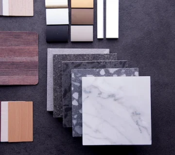
Choosing the best color for a ceramic floor depends on several factors, including the overall design aesthetic, the intended atmosphere of the space, and practical considerations. There isn’t a one-size-fits-all answer, as different colors serve different purposes. Here are some popular color options and their potential advantages:
Neutral Tones:
Beige or Taupe:
Advantages:
– Timeless and versatile, suitable for various design styles.
– Creates a warm and inviting atmosphere.
– Camouflages dirt and wear well.
Considerations:
– May lack boldness for businesses seeking a more vibrant aesthetic.
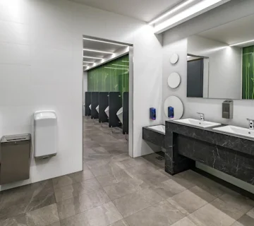
Gray:
Advantages:
– Modern and sophisticated, suitable for contemporary spaces.
– Conceals dirt and complements various color schemes.
– Allows for easy pairing with different decor.
Considerations:
– Some shades of gray may appear cold or clinical if not balanced with warm elements.
Warm Tones:
Brown or Earthy Tones:
Advantages:
– Creates a cozy and natural ambiance.
– Hides dirt effectively.
– Adds warmth and richness to the space.
Considerations:
– Darker shades may make a small space feel more confined.
Cool Tones:
Blue or Green:
Advantages:
– Evokes a sense of calm and tranquility.
– Can be used for a refreshing and modern look.
Considerations:
– May not suit all design styles.
– Can impact the perception of warmth in the space.
Light Tones:
Light Gray or Ivory:
Advantages:
– Reflects light, making the space feel more open.
– Versatile and adaptable to various design styles.
– Hides dirt and scuffs to some extent.
Considerations:
– Prone to showing stains or spills more visibly.

Dark Tones:
Charcoal or Black:
Advantages:
– Adds drama and sophistication.
– Conceals dirt and wear effectively.
– Creates a bold and impactful statement.
Considerations:
– Can make a small space feel more confined.
– Requires careful balancing with other elements to avoid a heavy look.
Choosing the Right Color:
- Consider Brand Image: Align the color with your brand identity and the image you want to portray.
- Assess Space Size: Lighter colors can make smaller spaces feel larger, while darker colors may suit larger areas.
- Think About Maintenance: Consider how well the color hides dirt and how much maintenance you’re willing to undertake.
- Balance with Other Elements: Ensure the color complements existing furniture, decor, and architectural features.
- Test Samples: Before making a final decision, obtain sample tiles and observe them in different lighting conditions.
Ultimately, the best color for your ceramic floor depends on your unique preferences, the specific requirements of your space, and the desired ambiance you want to create.
No comment